
Pantone’s 2023 Color of the Year “Viva Magenta” on the Red/Pink Carpet |
| Designers yearn for this time each year when the world’s most prolific color entity weighs in with its annual celebration of a particular shade. Pantone, the Mother of all Shade Experts, facilitates design-related colors for home décor, graphical arts, and so much more, and no one knows pigment like they do. | 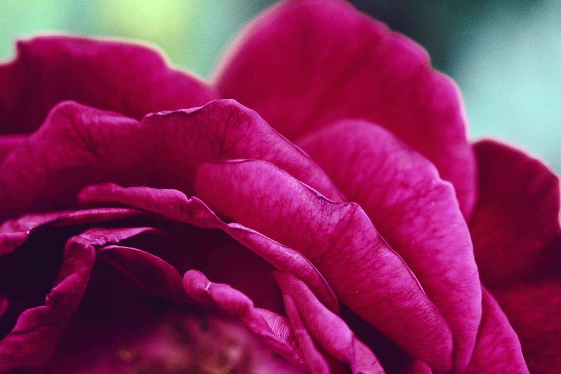 |
In a tribute to holiday spirit, Pantone has selected a truly rich, beautiful color for its 2023 Color of the Year designation. Meet Viva Magenta, an alluring version they call “crimson electric.”
Viva Magenta has roots in nature, originating from the primary red family yet embellished with subtle undertones of pink and blue. But make no mistake: there is nothing subtle about this delicious hue. It serves bold notice as a dominating tone when, used carefully, transforms interior spaces.
Magenta itself is not a newbie. It was a mainstay in retro times, hinting at a renaissance motif. Typically it is used sparingly because of its richness. Pantone leaves that distinction up to the beholder, suggesting generous incorporation with gradient shading, or even coating walls it its romantic splendor.
Viva Magenta’s moniker is an indicator of intensity and festivity. “Viva” translates to “life” and “living,” celebratory terms that vest permission to go all out in making this scrumptious color part of everyday life.
Some suggestions on how to accomplish that:
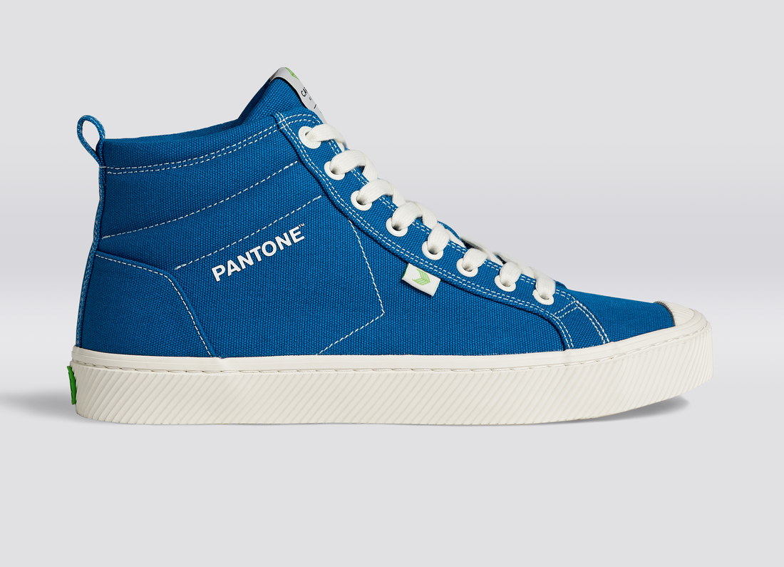
- Walk the talk. These festive sneakers from Cariuma commemorate this year’s COY with some high-tops that will not go unnoticed.
- Emphasize the botanical aspect of Viva Magenta with this stylish throw pillow cover, a lush, texturized addition to highbrow living spaces made available by Wayfair.
- Go fully modern with the geometric aesthetic of peel-and-stick wallpaper, a boon for kitchens and utility rooms.
- Words count! Simplicity is at work in a casual poster with the COY’s name in plain text here on Pinterest.
Photo by Ozark Drones on Unsplash
0 Comments
2022’s Color of the Year reflects a colorful year
It can be a tricky color to work with – let alone define – but periwinkle has worked its way into the annals of elite professional design circles. And it’s well deserved, as this striking shade mixing various versions of purply-blue serves as a provocative tone perfect for accenting.
The results are in: Pantone® Color Institute, the iconic guru of All Things Color, has chosen “Very Peri” as its signature Color of the Year for 2022. This should move interior and exterior designers into inspired action, creating style palettes with the blue/pink/purple composite at their core.
Pantone® is the go-to color entity, a source of shade standards for more than 10 million designers and producers worldwide.
Referring to “Very Peri” as a “symbol of the global zeitgeist of the moment and the transition we are going through,” Pantone® chose to make a topical statement. Not a bad idea for a profound point in history, and perhaps an intriguing way to reflect on interesting times by coloring our world with mood and vigor.
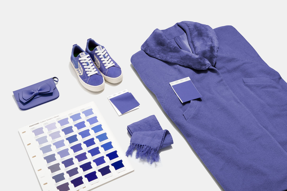
Conventional wisdom pins the periwinkle shade to a purple color family, though artful versions introduce subtle blues and even pinks to change it up a bit. It’s a staple in Bohemian-inspired décor, and it shows up frequently in fashion (including the iconic bridesmaid dress). Now periwinkle is officially blessed as a mainstream color to be used liberally, and with pride.
The true periwinkle traditionally features a violet-red undertone, which is not always obvious to the naked eye. As with any color, its appearance shifts depending on surrounding shades. This becomes important when planning interior design, from wall colors to furnishings, accent pieces to linens.
Interested in experimenting with the ingenue shade? Consult the Pantone® website for fabulous ways to work “Very Peri” into a design scheme, making the most of its multi-tone character. Its vibrant mix of shades invokes a spirited mood with plenty of options for assembling a truly pleasing space.
Pantone® has chosen some spectacular shades for past colors-of-the-year designations, including “Living Coral,” “Marsala,” “Sand Dollar,” “Tigerlily,” and most recently, the 2021 winner, a first-ever joint color of “Illuminating” and “Ultimate Gray.” Stay tuned for future picks that keep designers on their toes.
PANTONE® Color Institute Announces its 2021 Color of the Year
It’s tempting to see this as a piece of sardonic humor; a joke to cement the dire state of a twelve-month period unrivaled in recent US history. Most of us are hoping for a sunnier time head, but the realists at PANTONE® Color Institute—a commercial entity standardizing color tones—have made a selection for its color of the year 2021. And it’s a doozy.
But perhaps it makes total sense. It’s time to embrace gray with a little boost, and PANTONE®’s choice as the marquee shade duo for 2021 does just that.
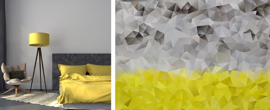
For the first time ever, the showcased tone blends two independent existing shades, PANTONE® 17-5104 Ultimate Gray and PANTONE® 13-0647 Illuminating, a sunny yellow. The refined result reflects “a message of happiness supported by fortitude,” the entity claims. This hybrid gray-yellow tone is seen as adding vibrancy to an old favorite. That is inspiring.
A broad reach
PANTONE® serves as an essential gauge for navigating through design projects, which are most often settled in the home décor sector, but also spill over into textiles and clothing, as well as graphic design for digital art. Interior design experts delight in the additions to PANTONE® color banks, and this year’s contribution is in keeping with fashion trends.
Gray has become a household favorite in home design. As this decade’s newest fashionable neutral, it replaces the whites, creams, and beiges from yesteryear. More homes than ever before are treated to decadent shades of gray in wall paint, flooring, furniture, and artistic décor.
In selecting its color-of-the-year designee, PANTONE® takes into account developing color influences that arise in pop culture, industrial design, art, fashion, and overall lifestyles. The year 2021 marks a shade of gray due to its bridging of seasonal factors, popularity in all areas of design, and a forecast of how it will shape the future of color choices. Adding the uplifting yellowed tone may be intended as a mood lift for those of us who have waded through a difficult year, which is pretty much everyone. Or, it might just be a lot of fun for designers.
Seeing is believing
Here are some of the ways our friends at PANTONE® look forward to 2021 with hope of prosperity, joy, and some epic design trends:
It’s tempting to see this as a piece of sardonic humor; a joke to cement the dire state of a twelve-month period unrivaled in recent US history. Most of us are hoping for a sunnier time head, but the realists at PANTONE® Color Institute—a commercial entity standardizing color tones—have made a selection for its color of the year 2021. And it’s a doozy.
But perhaps it makes total sense. It’s time to embrace gray with a little boost, and PANTONE®’s choice as the marquee shade duo for 2021 does just that.
For the first time ever, the showcased tone blends two independent existing shades, PANTONE® 17-5104 Ultimate Gray and PANTONE® 13-0647 Illuminating, a sunny yellow. The refined result reflects “a message of happiness supported by fortitude,” the entity claims. This hybrid gray-yellow tone is seen as adding vibrancy to an old favorite. That is inspiring.
A broad reach
PANTONE® serves as an essential gauge for navigating through design projects, which are most often settled in the home décor sector, but also spill over into textiles and clothing, as well as graphic design for digital art. Interior design experts delight in the additions to PANTONE® color banks, and this year’s contribution is in keeping with fashion trends.
Gray has become a household favorite in home design. As this decade’s newest fashionable neutral, it replaces the whites, creams, and beiges from yesteryear. More homes than ever before are treated to decadent shades of gray in wall paint, flooring, furniture, and artistic décor.
In selecting its color-of-the-year designee, PANTONE® takes into account developing color influences that arise in pop culture, industrial design, art, fashion, and overall lifestyles. The year 2021 marks a shade of gray due to its bridging of seasonal factors, popularity in all areas of design, and a forecast of how it will shape the future of color choices. Adding the uplifting yellowed tone may be intended as a mood lift for those of us who have waded through a difficult year, which is pretty much everyone. Or, it might just be a lot of fun for designers.
Seeing is believing
Here are some of the ways our friends at PANTONE® look forward to 2021 with hope of prosperity, joy, and some epic design trends:
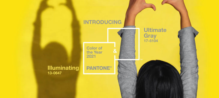
Hands Up to commemorate the 2021 two-shade tone.
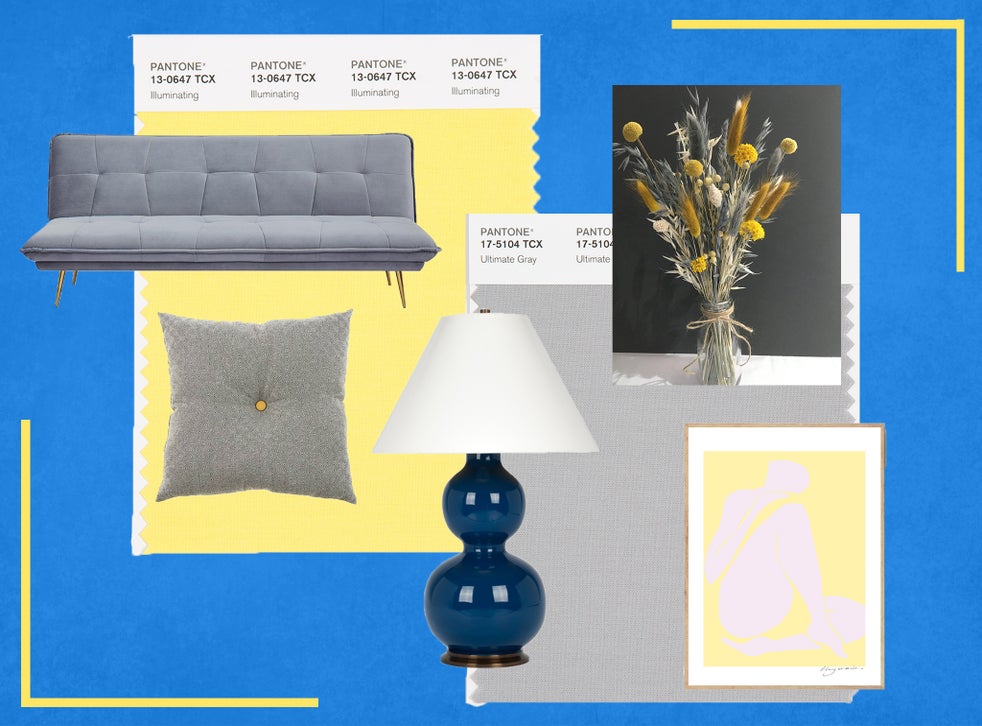
The design-forward shades sharing PANTONE®’s annual award mesh beautifully in all forms of interior design.
A retro vibe captures the dynamic blend of gray and yellow with modernizing effects.
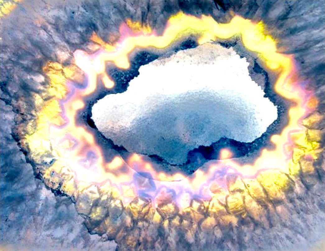
Special effects drive home the captivating blend of PANTONE®’s blended 2021 Color of the Year.
The color king chooses classic blue as its color of the year
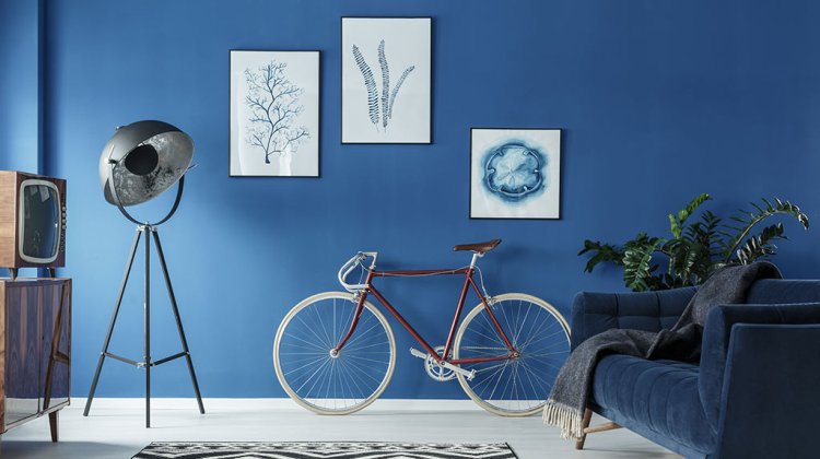
If there are fifty shades of gray, count on triple that for an old favorite: blue. Pantone gets this and, in typical fashion, is not afraid to lean on it for its 2020 “color of the year” designation.
The marquee source for go-to color advice, Pantone Color Institute™ supplies designers, graphic and print artists, and hobbyists with definitive hue-related tips and hints. Its licensed shades offer industry standard consistency as they create vivid, sublime, or subtle colors. For 2020, Pantone has selected classic blue as its annual designee.
And classic it is, as this version of blue is a compelling blend of rich and neutral, dark and medium; its utility in home interior design, clothing, and art is unlimited. Blue is making a comeback in the second decade of the 21st Century, and Pantone is celebrating in style. This is a win-win for designers of denim clothing, and an intriguing potential boost for designers of modern furnishings.
Among shades on the master list of Pantone blues that sing the blues are navy to royal, French to robin’s egg, and sky to Copen. Classic blue seems to be a happy medium with contemporary significance. Find it in bed linens, tapestries, furniture finishes, artwork, and even kitchen appliances. Blessed with versatility, it’s still a really gorgeous shade you’ll want to focus on and work with.
Seeing is believing
Consider this eye-catching paint job, courtesy of none other than classic blue:
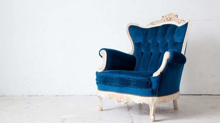
Classic blue velvet offers a rich, romantic feel to this velvet upholstered chair:
And casual is as casual does, with this high-top sports shoe reaping the benefits of Pantone’s honored color:


© COPYRIGHT 2020. ALL RIGHTS RESERVED.