
Bottom Up Let’s start at ground level. Solving pet mess issues is a constant struggle, leading flooring manufacturers to come up with smart solutions. What if your design-forward flooring were primed to resist urine stains? And better yet, is resistant to seeping and damaging floorboards? It’s a reality with conventional products, but a new approach developed by a Seattle contractor is specially engineered to mitigate harm. Pet Decorator® by Tami Michaels creates a permanent solution for a long life of making homes pet-friendly. Once the first layer is in place, you’re free to set up spaces both inside and out to improve livability for the canine set. With no shortage of fancy dog beds and even more elaborate couches on the market, let’s get real: they’d rather be sitting with the fam. Check out this assortment of sofas and furniture that tolerate and even resist pet hair, from Coaster. And since they usually allow you to sleep in your bed with them, but might need assistance getting there, ramps with step grids make access a breeze. Or opt for a more designer look and choose fabric-covered steps that add a less obtrusive glam factor. Dinner time! Add a chic look to feeding stations with a tilted dog bowl designed both for aesthetics and avoiding messes. If your fuzzy friend acts more like a vacuum cleaner than an animal, she may benefit from a true cognitive challenge that will slow the pace and improve digestion with a puzzle-style feeder, both fun and productive. Al fresco entertaining is a big hit with the four-leggeds, and though grass-rolling may be a fun gig, they need a shade break just like we do. This wicker outdoor dog sofa delivers a stylish open-air experience with the aesthetics of a people house, and plenty of space for relaxation. Now that you’re up to speed with a few ideas on how to tackle interior and exterior décor from a pet perspective, consult with the true experts (you know who they are) to nail down their preferences, and shape a household conducive to co-existence and supreme comfort. Photo by Brooke Cagle on Unsplash
0 Comments
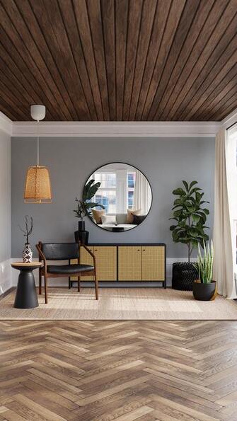
A Start Toward Reimagining the Tiny House Concept
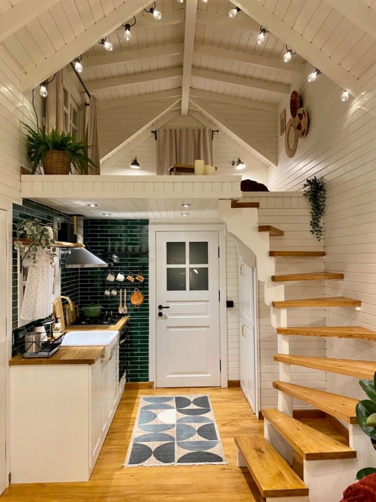
The most notable way to increase actual space in a mini-unit is stacking. Layering. Keeping in mind that a second story accessible through stairs only might be physically challenging, you’ve likely accepted that before making the decision to downsize. Curved staircases and angled elements in lofts create an exceptional visual impact, such as this example in a tiny space dedicated website. This diminutive abode gives off a far more spacious look with its fresh, light palette, use of natural wood, and geometric accenting. Other considerations for making a tiny space work for you are:
Whether you settle on a conventional tiny house, rehab a vintage school bus, or choose to permanently camp out in a recreational vehicle, you should think smart and visualize a livable space with the help of talented designers accustomed to tackling all sorts of challenges in massive or microscopic living areas. Start with a page like this for tips. Image rights owned by Living in a Tiny, linked here and above.
Design Tips When You Don’t Own Your HomeMore then ever before, Americas are renting their homes. And while there are certainly perks to that choice, but there are a few drawbacks when it comes to your interior design. Namely, that you’ve got rules to follow. And while they’ll vary from one home or apartment to the next, generally, you can’t make big design changes. Don’t love the chandelier in the dining room? Not a lot you can do. Wishing you could add a ceiling fan in the bedroom? Probably not going to happen. And forget making wholesale changes to flooring… But that doesn’t mean you can’t do anything to really reinvent your space and make it feel a whole lot more unique and personalized to your taste. So, here are our best tips for creating a look you love: Patterns! From peel-and-stick wallpaper to create an accent wall, to funky throw pillows on the sofa, adding patterns in your home create instant texture and dimension. And don’t sleep on peel-and-stick tiles! They’re a great way to perk up a backsplash, add detail to bathroom, or even define and entryway. We love these Terrazzo tile decals from Chasing Paper. 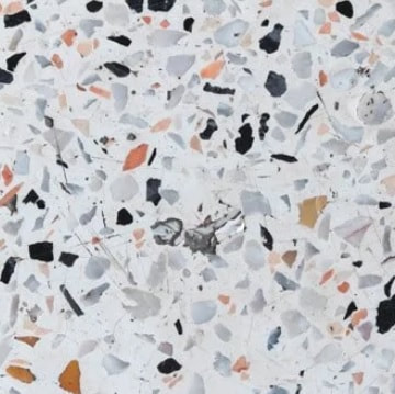
Flooring! Sure, you can’t tear out that wall to wall carpeting and add hardwood, but you can certainly add area rugs that introduce personality and create a look that’s a whole lot more interesting than boring beige. We love Ruggable – they’re washable! – and come in tons of fun patterns, colors, and sizes. You don’t have to commit right away, start with a couple small rugs in the entry or kitchen and then when you love it, graduate to that 8x10 in your living or dining room to really make a statement. Something like this rug from Wayfair adds color and pattern, but you can go as subtle, or as bold, as you’d like here. 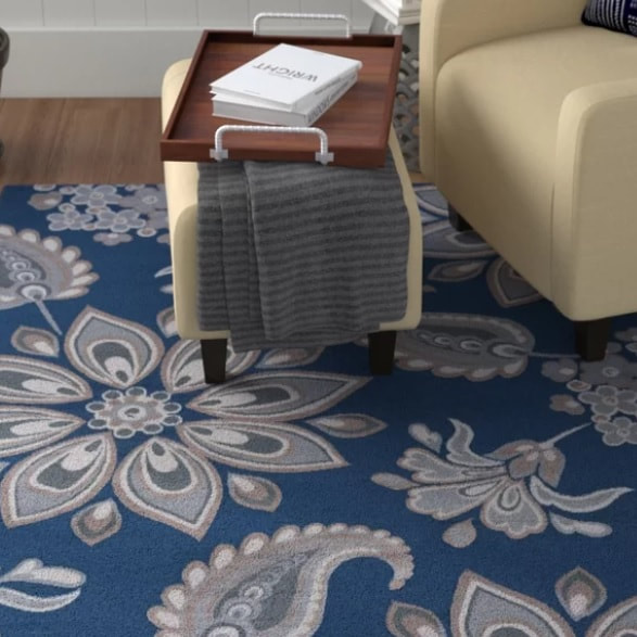 Of course, there’s a ton you can do with decor – everything from bedding to upholstery to furniture style – to make you home feel like, well, home. What are your best tips and tricks? We want to hear about them in the comments. All images belong to their respective owners, each linked above.
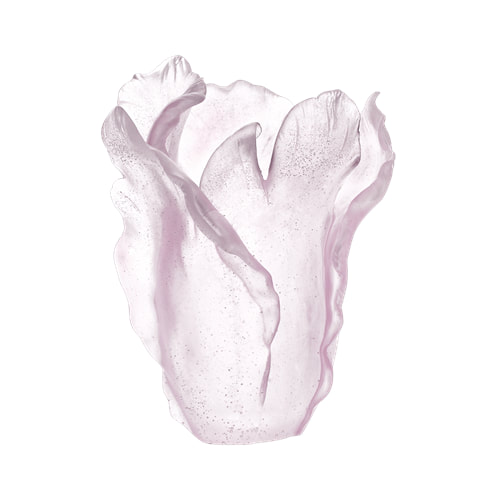
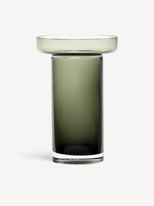
Peruse the seemingly endless rows of tulips in a litany of colors, and buy bunches at the gift shops run by growers. And … then what? Well, pick a vase to show them off once you get home. It’s not rocket science, but it seems like a décor guru’s dream to pair their fave flower with a receptacle that brings it to life. We’ve found a few that whet our whistle, and work for budgets from meager to extravagant. three we love:
Be mindful of the sadly short seasonal life span of tulips. The premiere Skagit Valley variety stick around just a few weeks before growers harvest bulbs for future blooms. And maybe that’s a good thing. We appreciate them more when they make a timed appearance.  Photo Credit: Pam Headridge Images belong to their respective owners, each linked above.
Ultimately your environment is personal; expressing your signature design statement may initiate with an “expert” idea, and drawing on that is inspiring.
Here’s what else these gurus of style have to say:
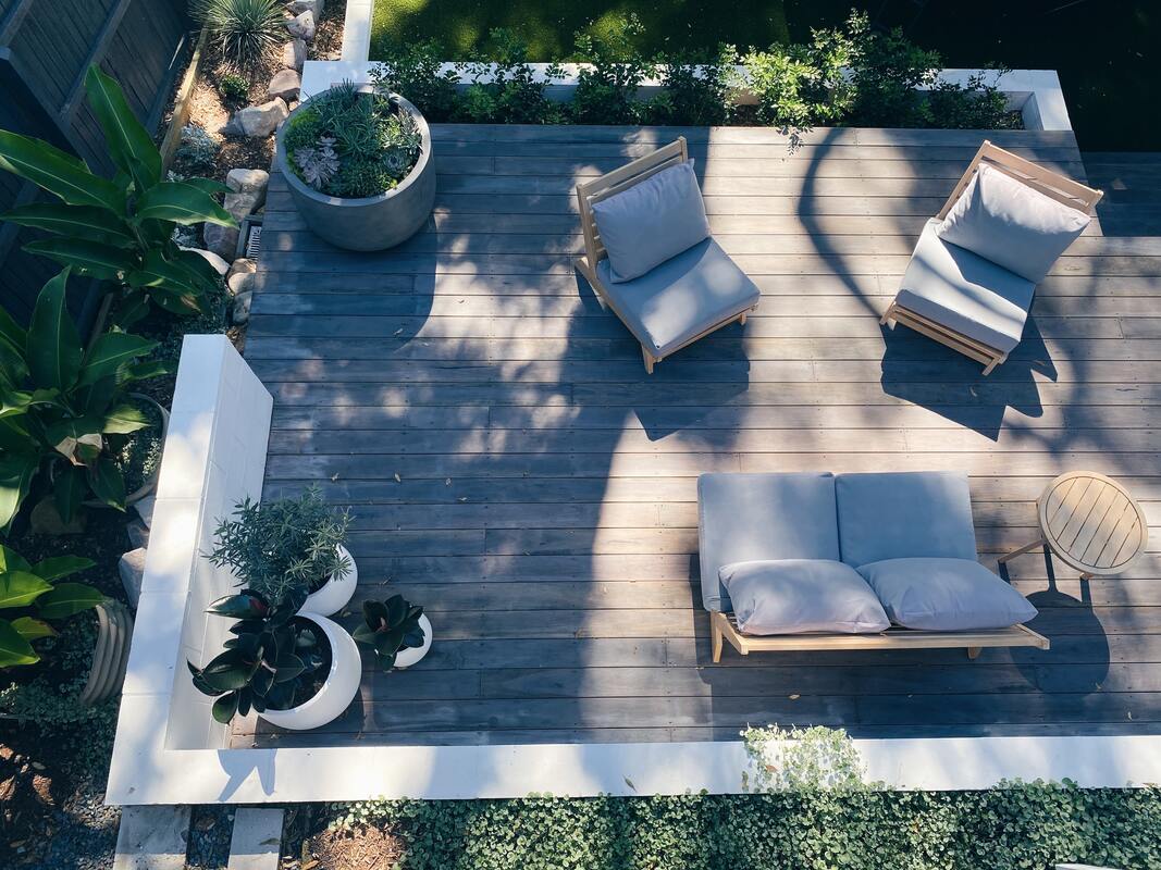
Modular Furniture Upscale outdoor furniture is just one of the 2022 home design decor trends. But modular furniture makes it easy to rearrange your outdoor entertainment area as needed. Perfect for large families or couples who love to entertain, modular furniture can be as compact or as spacious as you need. Hosting a backyard barbecue? Open up your modular seating to make it flow around a fire pit or coffee table, inviting guests to shift in and out as they top off plates and drinks and mingle. Modular furniture can be moved about at will, even creating multiple seating areas throughout the patio or yard. Attractive Outdoor Landscape Lighting Landscape lighting and lighting accessories allow us to enjoy a beautiful outdoor space for longer into the night. If it wasn’t too long ago you relied on auto sensor flood lamps to simply take out the trash, it’s time for an upgrade! Today, you’ll find a plethora of attractive outdoor lighting that offers a lovely glow and soothing ambiance, from charming cafe lights that can be strung over entertainment areas to solar-powered table lamps and decorative orbs to rest in the grass for a magical atmosphere. However you choose to illuminate an outdoor space, it’s sure to set the mood for the evening. Wicker and Rattan Furniture Once a bygone material of the late 80s and 90s, rattan and wicker have made a huge comeback, especially in patio furniture that offers a well-traveled bohemian style and hand-made feel. Of course, when you incorporate wicker or rattan outdoors, aim for a synthetic material that can withstand the elements, resisting sun damage, mold and mildew. Resin wicker, all-weather wicker or synthetic rattan resembles the real stuff rather convincingly and can be left outdoors all year round in most environments. Of course, you can always choose natural wicker or rattan, so long as it’s a more versatile furniture piece you expect to carry back indoors most of the time. Egg Chairs and Loveseat Swings With an open invitation the new outdoor space, you can still create a small retreat of your own. Swinging egg chairs and loveseats create a more intimate hideaway where you can curl up for a midday nap or get some fresh air and meditate. Sit inside its cozy embrace and you’ll see what we mean. Of course, many egg chairs are designed with all-weather wicker or rattan, which brings in another summer outdoor design trend. Drop an egg chair in a corner of a patio with an accent table to keep drinks and snacks nearby and toss a few colorful pillows inside your little intimate haven. Concrete Textures Concrete certainly has its place outdoors. However, in 2022, concrete will be used to create a more raw nature for outdoor furniture. From small side tables that invite you to rest a drink to oversized fire pits to bird baths, concrete offers a lovely texture that can stand out among the green grass of a lawn or a wood-planked patio surface. The biggest advantage of molded concrete furniture and accessories is that they will last for many years to come. If you are turned off by the idea of sitting on a cold concrete surface, simply lay down a few bench cushions and throws that offer warmth and a splash of pattern and color. Bold Prints and Retro Colors Bold prints like leafy palm fronds, florals and cabana-inspired wide stripes can offer visual interest to a basic Japandi style setup. Retro colors like oranges and cerulean blues set off the greenery backdrops and lend a vibrancy that catches the eye. Choose bold prints and retro-colored pillows, cushions, accent tables or bar cart accessories that can be swapped out for a fresh update when you wish to adapt to the trends. Photo by Cameron Smith on Unsplash
The Best Boho Design Ideas for a Fresh & Fun Living SpaceAre you looking to live your best boho life? With a nearly endless amount of textures, patterns, and decor options to consider, this is a fun design theme to incorporate into your space. You can design your entire living area with bohemian flair or add subtle elements for a pop of visual interest. No matter how you choose to design your boho space, let's talk about the fundamentals of this style and your must-have items.
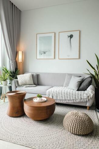
HOW TO BRING BOHO DESIGN TO YOUR SPACENow that you know the back story about boho style, it's time to create this care-free appeal in your own space. Consider the following boho design ideas to leave you feeling inspired: Boho Furniture What is boho furniture? Look for minimalist items and side chairs crafted from wicker or bamboo. You can also incorporate furniture with a hint of antique flair, or items that are slightly worn and weathered. You also don't want to overcrowd the room with furniture as the idea is to create an airy space. However, the fun part about selecting boho furniture is finding what speaks to you. It's all about the free-spirited and individualist look. The Best Colors for Boho Decor What colors are best for a boho-style living room? Neutral colors help achieve the calm and dreamy allure of boho. You'll find a lot of brown with boho as well as black. Earthy tones complement this design also. If you wish to add an exotic touch, consider a splash of burgundy or even leopard print. Have Fun with Playful PatternsSpeaking of leopard print, patterns in general are a great choice for boho living rooms. You'll find a variety of eye-catching prints to use with boho, such as geometric and tribal. Cushions, rugs, pillows and throw blankets can all be layered up with boho patterns. The pattern you choose should match your personality, but feel free to mix it up so it doesn't look like a "matchy-matchy" room. You don't have to stick with a particular color palette, either. The pattern can be neutral as long as it's still interesting. Turn up the Boho Flair with Texture Just like patterns, texture is another staple element of boho style. Think in terms of fringe, lace, or even crochet. For example, you can feature a throw pillow on your sofa that has an embroidered geometric print. This incorporates the pattern and texture components of boho design. Perk up Your Space with Plants One of the last boho design elements to consider is plants and greenery. Since you are using mostly neutral tones throughout your space, greenery adds some color without overwhelming the overall style. Place a couple of plants on your coffee table, some on bookshelves or in corners to add some charm. Be warned that not all plants are easy to maintain. A cactus, succulents, or a small indoor tree are great choices without a lot of maintenance. There are also fake plants that you can choose that look quite realistic. With these tips in mind, you're well on your way to a boho-chic living space that you'll never want to leave. I don’t know about you, but I’m over the minimalist trend. While it’s easy to appreciate a neat and tidy home, something about the aesthetic leaves a lot to be desired. Where’s the excitement? Where’s the personality? And where, oh where, are the colors? Enter maximalism, a daring and dramatic design trend that’s anything but boring. Blending rich colors, bold patterns, sumptuous textures, and layers upon layers of decorative accents, the maximalist aesthetic is a stunning symphony of sensory delight. Whether you find yourself feeling limited by conventional décor schemes, or you simply want your space to reflect the many facets of your personality, this exciting trend offers endless inspiration to design the home of your dreams. 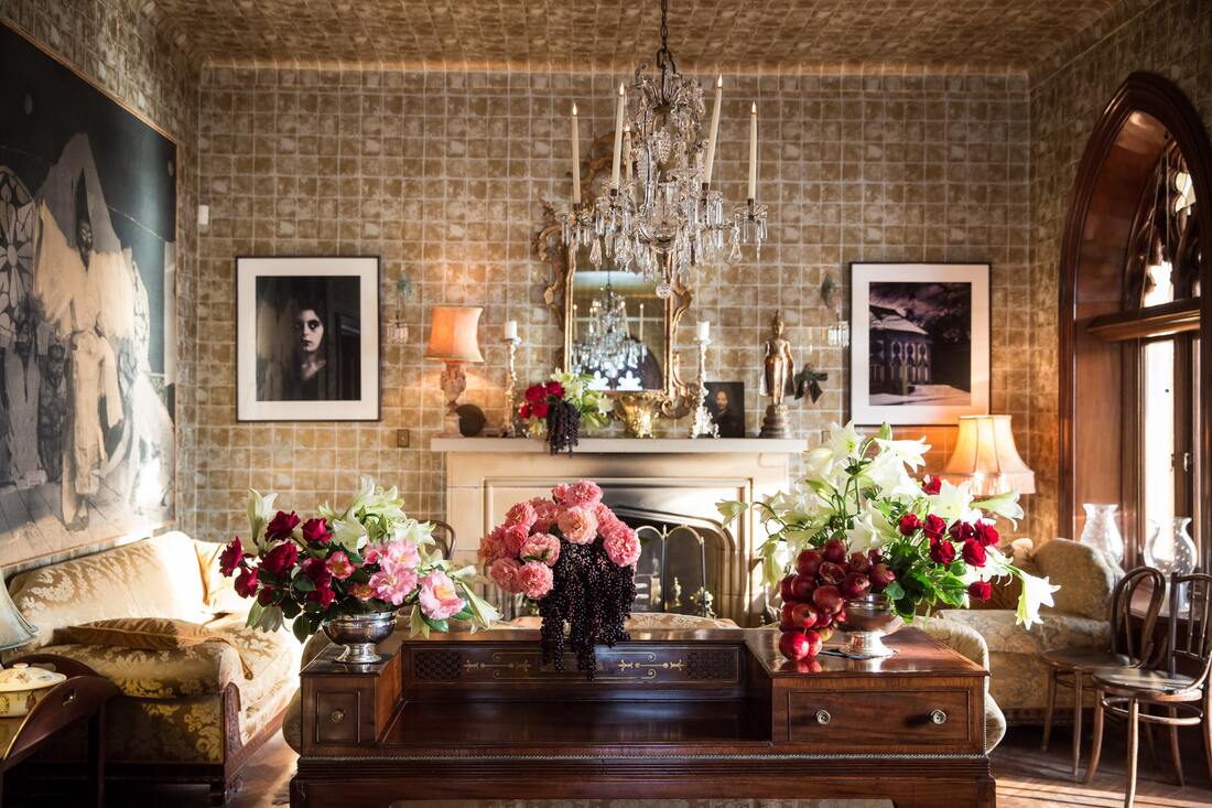 But how do you pull off such an over-the-top aesthetic without making your space look cluttered? There is a big difference between maximalism and mess, but there’s also a method to the max-ness. Here are a few ideas you can incorporate to strike just the right balance and make maximalism work for you. 1.Consider a triadic color scheme. One of the hallmarks of maximalist décor is its dramatic use of color - the brighter, the better! A triadic color scheme is a great strategy for choosing a variety of bold, bright hues that complement rather than clash. In color theory, a triadic color scheme combines three different colors that are evenly spaced apart on the color wheel. To keep things simple, bear in mind that the basic color wheel contains four potential combinations:
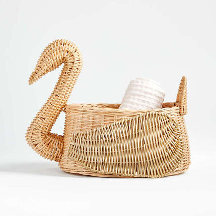
And of course, don’t forget about the blacks, whites, and neutrals that can really make those colors pop! 2.Display, display, display. Perhaps your collection of seashells or souvenirs is collecting dust in a drawer. Or maybe you’re tired of pulling out a photo album to relive your favorite memories. Whatever the case may be, maximalist décor leaves plenty of room to experiment with decorative display. Ideally, every wall and surface should be adorned with things you love to look at! You might consider dedicating a wall to a floor-to-ceiling arrangement of framed photos and art. Decorative accents like plants, mirrors, art sculptures and tapestries are great for adding visual appeal. And definitely don’t shy away from accent tables and shelves. Not only do these pieces add dimension to décor - they also create the perfect home for curios, collectibles, heirlooms, and more. 3.Bring on the boldness. Who says you can’t have more than one statement piece? If you’re struggling to choose between a commanding Chesterfield sofa and a modern accent chair wrapped in bright, patterned fabric, a maximalist décor scheme gives you the freedom to incorporate both styles - and more! Maximalist décor is, above all else, bold, and it will never have just one focal point. Think funky, statement-making furniture, dramatic area rugs, sparkly chandeliers, and lots of colorful art. And don’t be afraid to draw inspiration from a variety of different design aesthetics. Much like the eclectic décor trend, the maximalist home includes a little bit of everything. 4.Play with patterns. Mixing patterns is not for the meek. (Neither is maximalism, for that matter!) Even if most of us wouldn’t want to include multiple patterns in one outfit, there’s a way to make it work when it comes to home decor. You could consider a mix of paisleys, plaids, and polka dots that are all the same color. You could also choose a variety of pieces from the same family of patterns – think animal prints, geometrics, or different sized stripes. Although it may take some experimenting to create the look you like, bold patterns are an essential element of maximalist design. 5.Remember that it’s not about “stuff.” If you want to create a maximalist home that doesn’t look cluttered, remember that it’s not just about filling up space. Maximalism isn’t about cramming a room full of random items. It’s about creating a bold blend of colors, patterns, and textures that capture the senses like candy to the eye. It’s about decorating your space with items you love and that reflect your unique personality. No matter which décor scheme you choose for your home, there’s one rule of thumb to keep in mind. Whether it’s fashion, functionality, or just plain fun, every item in your home should serve a purpose. This guideline is true for any decor scheme – even maximalism! Maximalism’s heavy focus on fashion and fun sets this showstopping design trend apart from the rest. Conventional wisdom says it’s often harder to settle on décor for a newborn’s nursery than a main living space, and given the heightened anticipation of a brand new life, it’s not surprising. That there are millions of configurations, styles, genres, and colors makes it that much more confusing. Welcome to parenting, where making choices is an endless obligation. Design gurus at HGTV caution against bold, bright colors for infants, if that helps. They tap into psychology to explain that basic primary tones such as black, white, and gray are instantly absorbed by wee ones. Okay, we’ll bite. Let’s explore a gray base – topped off with a bit of soft color. Gender-neutral is a trend we can go for, so here’s a compilation we like. Let’s start with the most noticeable feature of a nursery or any room: wall coverings. Paint is fine, but why not create a narrative with a decorative swan theme? This gender-neutral, pale green wallpaper offers a soothing arrangement of regal swans, adding the inspiration of nature and wildlife. 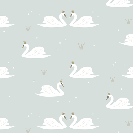 Heeding the tone advice from HGTV, we’ll settle on gray for basic furnishings. This crib is not only crisp and stylish, but it’s convertible. It grows with your baby’s development and becomes a toddler bed, which is a definite plus. It’s also versatile and attractive, and available in a soft shade of gray. Paired with a gray changing table, and you’re well on your way. Those 2 a.m. wakeup calls benefit from a comfy rocking chair, and this one caught our eye. Its classic stripe pattern incorporates gray with a soft cream to coordinate with your wallpaper in a totally trendy way. You’ll need illumination to avoid bumping into nursery staples, and this elegant light – though not technically a swan element – weaves in a similar species with its gooseneck design, as well as saves surface space with its wall mount. 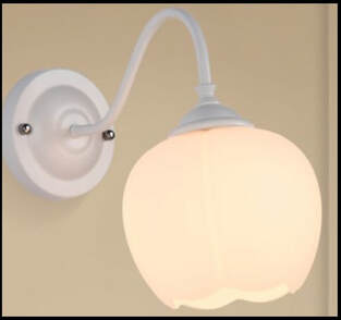 Got wood floors? Kick around the idea of a cheerful rug that ties in the palette we’ve assembled so far. The spotted and striped pattern of this festive hand-made nursery rug sparks an extra level of uplifting attitude. Accessories count! The simple artistry of this theme-building swan mobile delivers a subtle yet charming look. 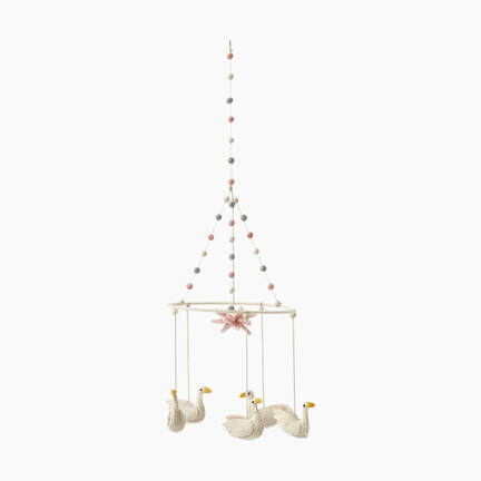 Finally, a storage basket is a must-have for nurseries, and we found one perfect for the occasion. This natural rattan basket continues the legendary swan theme as it infuses casual charm perfect for the ensemble we’ve created.
It’s the Little Things That Make a Difference |


| The room I spend the most time in, and yet, the one that always seems last in line for decor I love: the master bedroom. Probably because so many of those hours are spent in the dark, asleep. If your bedroom is anything like mine, it’s become the catch-all spot for whatever might not have a dedicated space at that moment. It’s out of the way, guests don’t see it, and we just sort of live with the clutter. My master bedroom could use a little work. |  Photo by Drew Beamer on Unsplash |
It hit home just how ignored the master bedroom was when we moved last fall. Suddenly, I had a blank slate and the opportunity to start from scratch. But let’s be real: I’m a girl on a budget, so a full-on bedroom redesign isn’t in the cards. We decided we had three goals for this new bedroom:
So, clutter. The biggest thing there is to stop tossing stuff into the master that doesn’t belong there. The next thing is clearing surfaces. Added a few shelves and bins in the closet (bigger in this house, yay!) and that made clearing dresser and chest tops easy. Rearranged to get phone and tablet charging off of our nightstands, which helped SO MUCH in terms of keeping the room looking clean and streamlined.
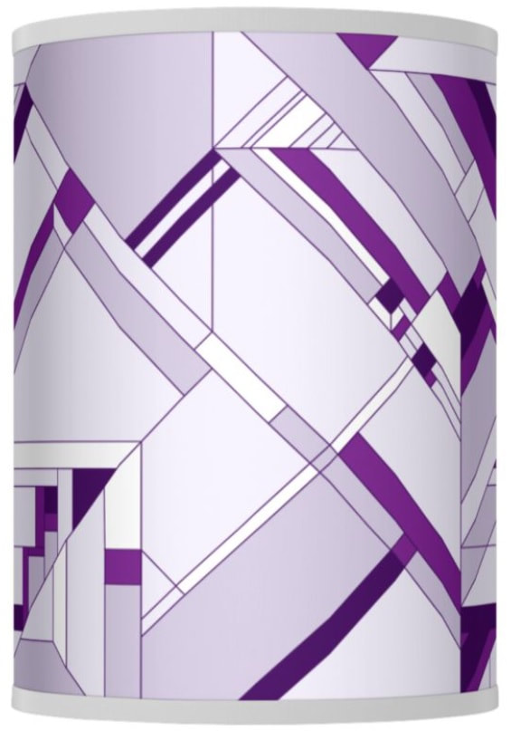
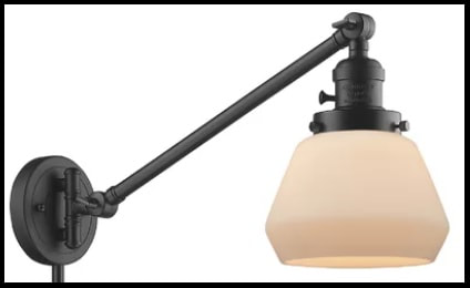
Bedside lighting – this is where it got fun. My husband likes bright light at the bedside, my eyes are super-sensitive and exposed bulbs or weak shades/diffusers are a big no-go for me. In service of cutting clutter, we decided plug-in wall sconces were going to be our solution here. We just had to agree on a style. He wanted simple and functional, I wanted stylish and eye-catching. His suggestion was something like this classic swing arm wall lamp. Nothing wrong with it, but it’s nothing I’m getting excited about. I countered with this cool floating orb style, but he hated it. Cue my sad tears. But I get it, he’s a simple guy and these would definitely stand out every time he walked into the bedroom.
A few long conversations later, he really wanted something adjustable for reading in bed. I really wanted a contemporary look and soft illumination. What’d we end up with? A pair of these:
- Get rid of the clutter!
- Add bedside lighting that matches and works for both of us.
- Brighten it up.
So, clutter. The biggest thing there is to stop tossing stuff into the master that doesn’t belong there. The next thing is clearing surfaces. Added a few shelves and bins in the closet (bigger in this house, yay!) and that made clearing dresser and chest tops easy. Rearranged to get phone and tablet charging off of our nightstands, which helped SO MUCH in terms of keeping the room looking clean and streamlined.
Bedside lighting – this is where it got fun. My husband likes bright light at the bedside, my eyes are super-sensitive and exposed bulbs or weak shades/diffusers are a big no-go for me. In service of cutting clutter, we decided plug-in wall sconces were going to be our solution here. We just had to agree on a style. He wanted simple and functional, I wanted stylish and eye-catching. His suggestion was something like this classic swing arm wall lamp. Nothing wrong with it, but it’s nothing I’m getting excited about. I countered with this cool floating orb style, but he hated it. Cue my sad tears. But I get it, he’s a simple guy and these would definitely stand out every time he walked into the bedroom.
A few long conversations later, he really wanted something adjustable for reading in bed. I really wanted a contemporary look and soft illumination. What’d we end up with? A pair of these:
He gets adjustable, I get a great diffuser (and added a dimmer!) and we both get the coordinated and composed look we were going for.
Our final task -- brightening up the bedroom -- took a little creativity because of the things we decided NOT to change. Namely the dark gray blackout curtains and medium gray quilt paired with black finish furniture. His suggestion was to add some white pillows to the bed. Sure, that’d help, but it’s boring. I ended up just coming home with throw pillows similar to these bright yellow, geometric beauties and trusting he wasn’t too invested in the pillows he tosses on the floor before crawling in bed at night. (Spoiler alert: He isn’t.)
The last major thing was a little more time consuming, but still fun. We created our own art with four fun frames, each with a different shade of yellow to create an ombre effect. We painted the frame and a panel to go inside in each of the four shades, and then hung them side by side to span the width of the bed. Simple, clean, modern, and definitely brightens up the bedroom!
Final verdict? Easy changes that didn’t require too much cash and I LOVE the results.


© COPYRIGHT 2020. ALL RIGHTS RESERVED.